2024 world series rebrand
Background
The goal was to create a fresh, compelling mark for the World Series—one that honors its prestige and tradition while unifying branding across platforms. The design balances classic typography and vintage baseball aesthetics with a modern, cohesive identity.
Outcome
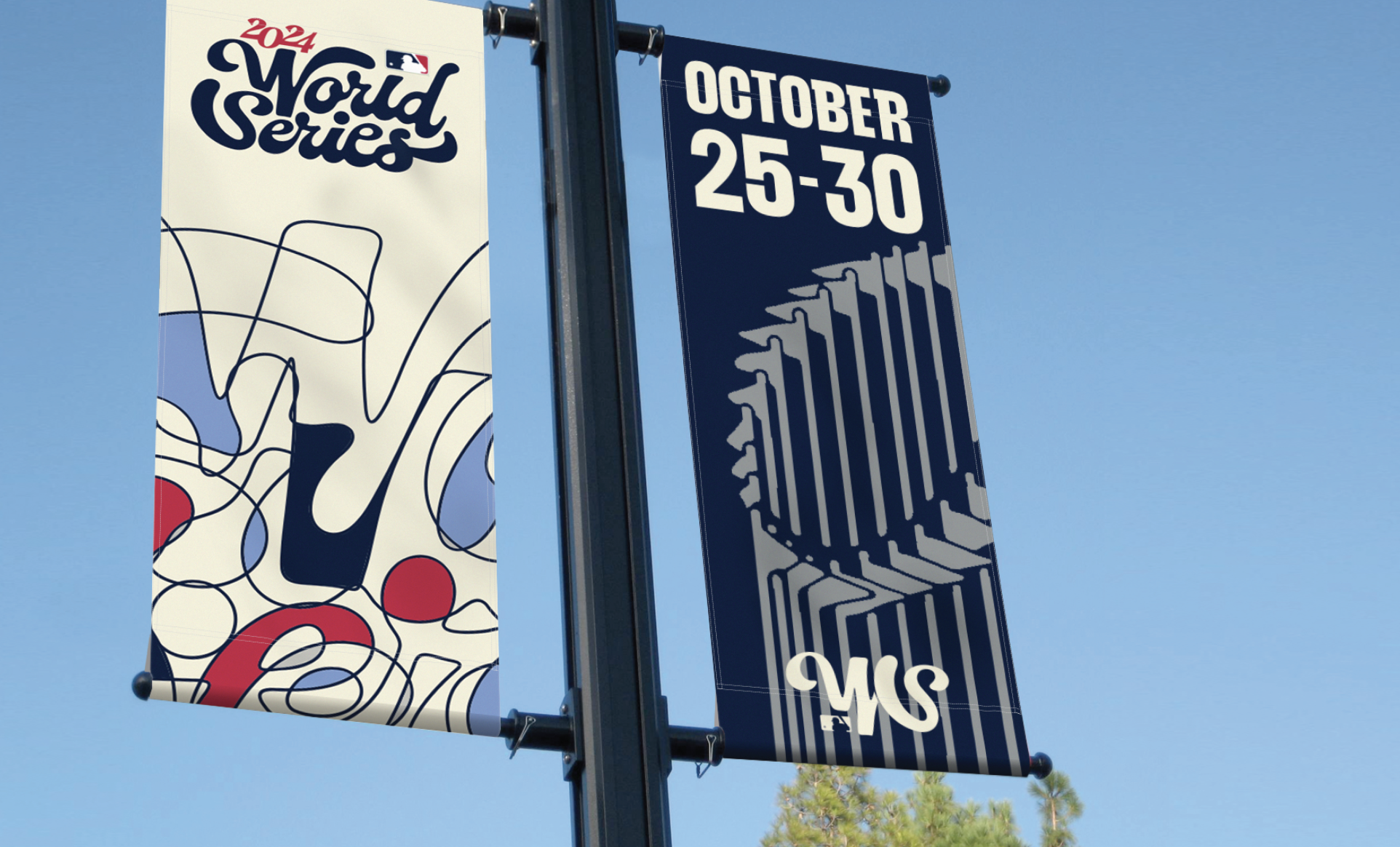
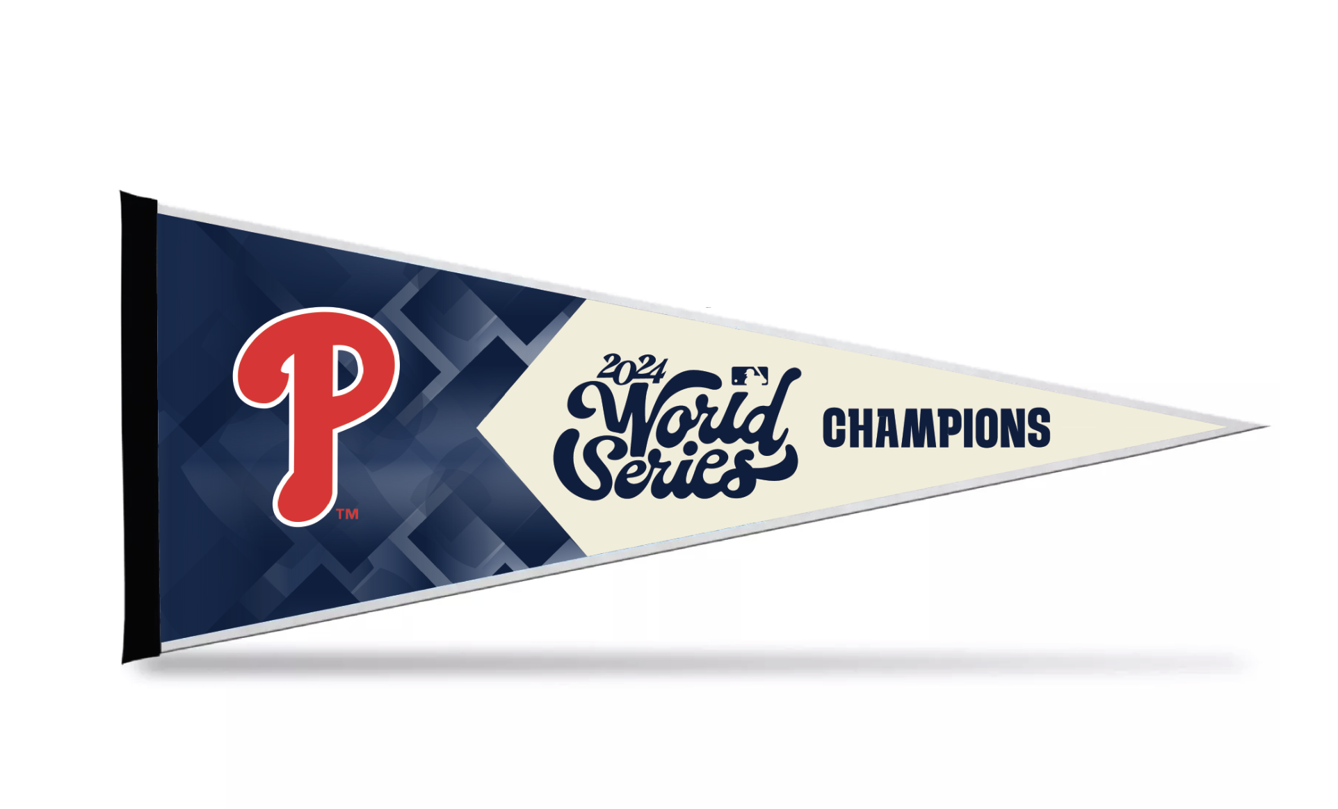
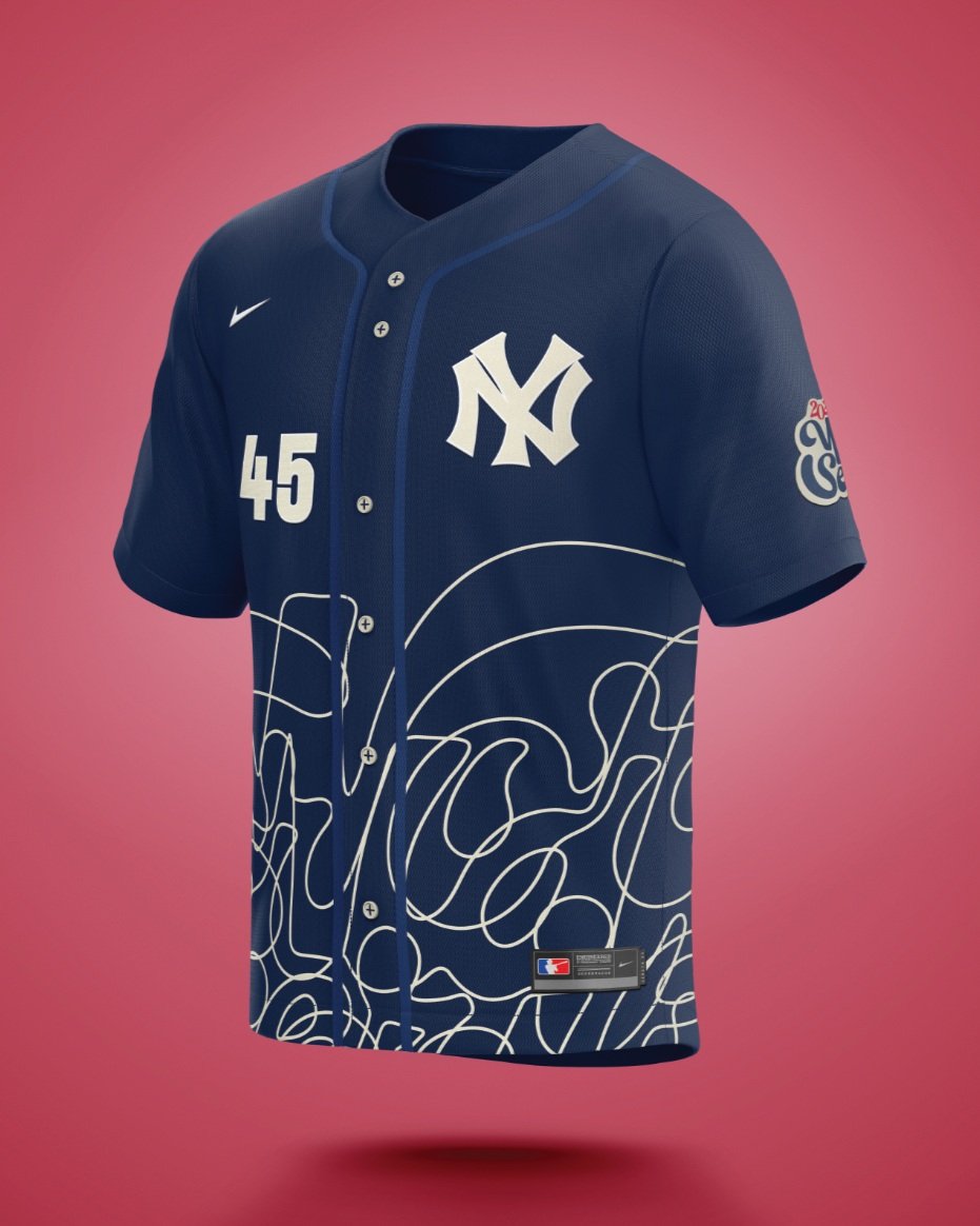
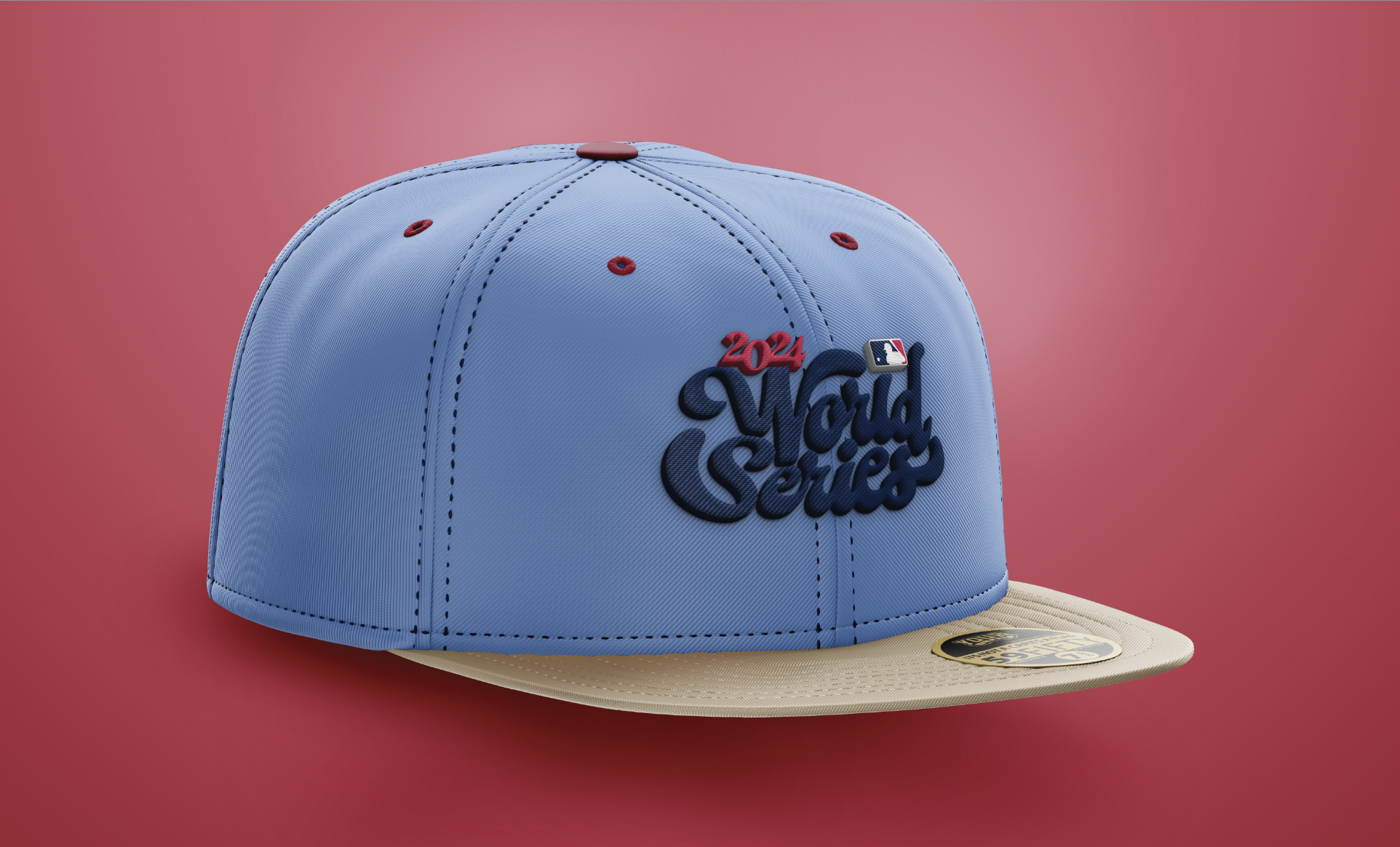
I designed a primary and secondary logo inspired by vintage baseball aesthetics, establishing a timeless yet modern look. To ensure consistency, I developed a pattern incorporating the logo and, with my professor’s guidance, created a custom typeface, Series Bold, specifically for the visual identity. These elements were applied across collateral, including custom World Series jerseys, integrating logos and typography to honor tradition while introducing a fresh, cohesive look. The final rebrand respects the event’s legacy while providing a more unified and contemporary identity.
Art Direction
Joe Bosack
Details
Sports Branding
16 week course
Disciplines
Visual Identity
Photo Editing
Environmental Design
Logo Design